
RAINBOW FARFALLINE
Folding Carton
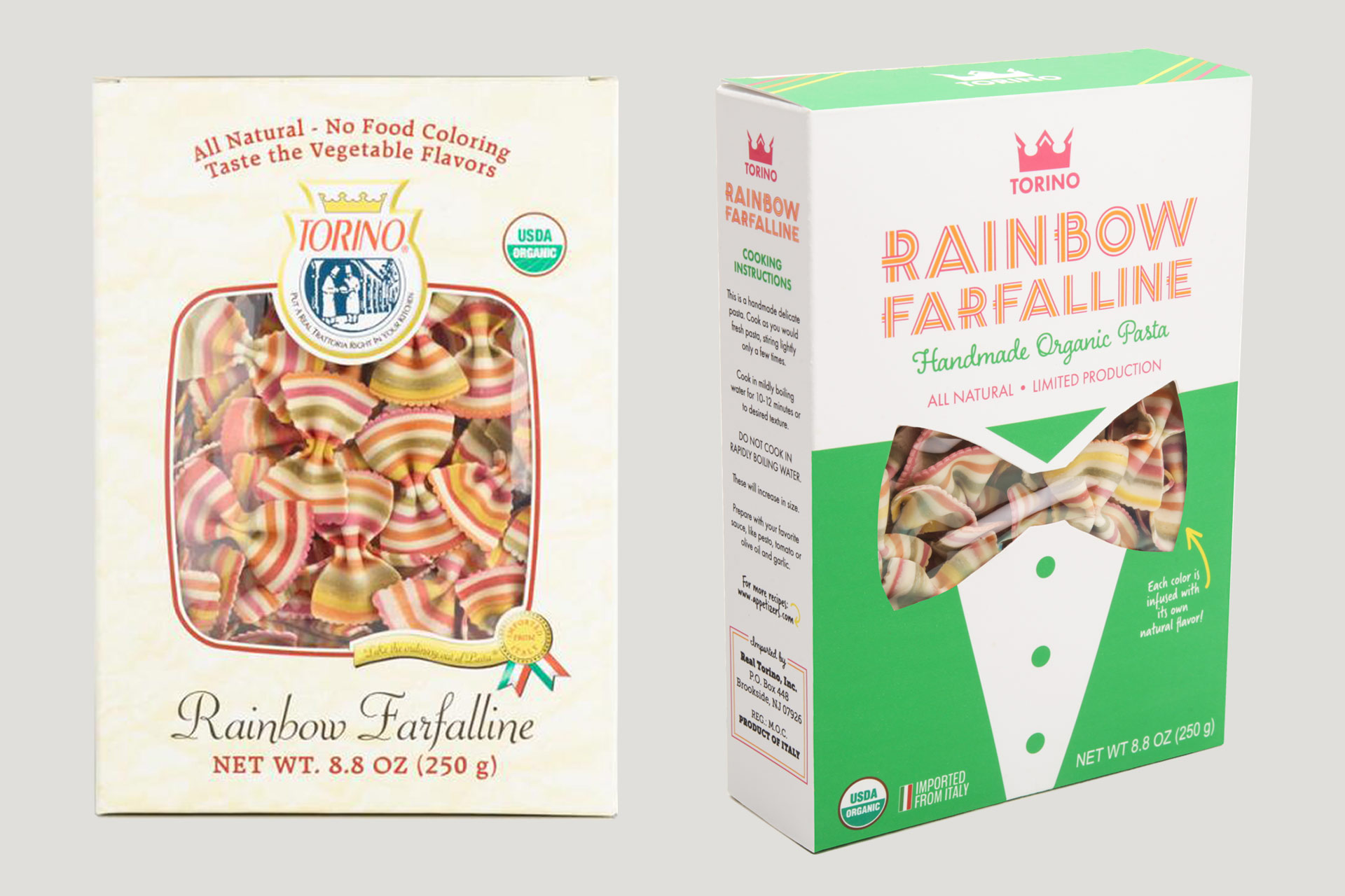
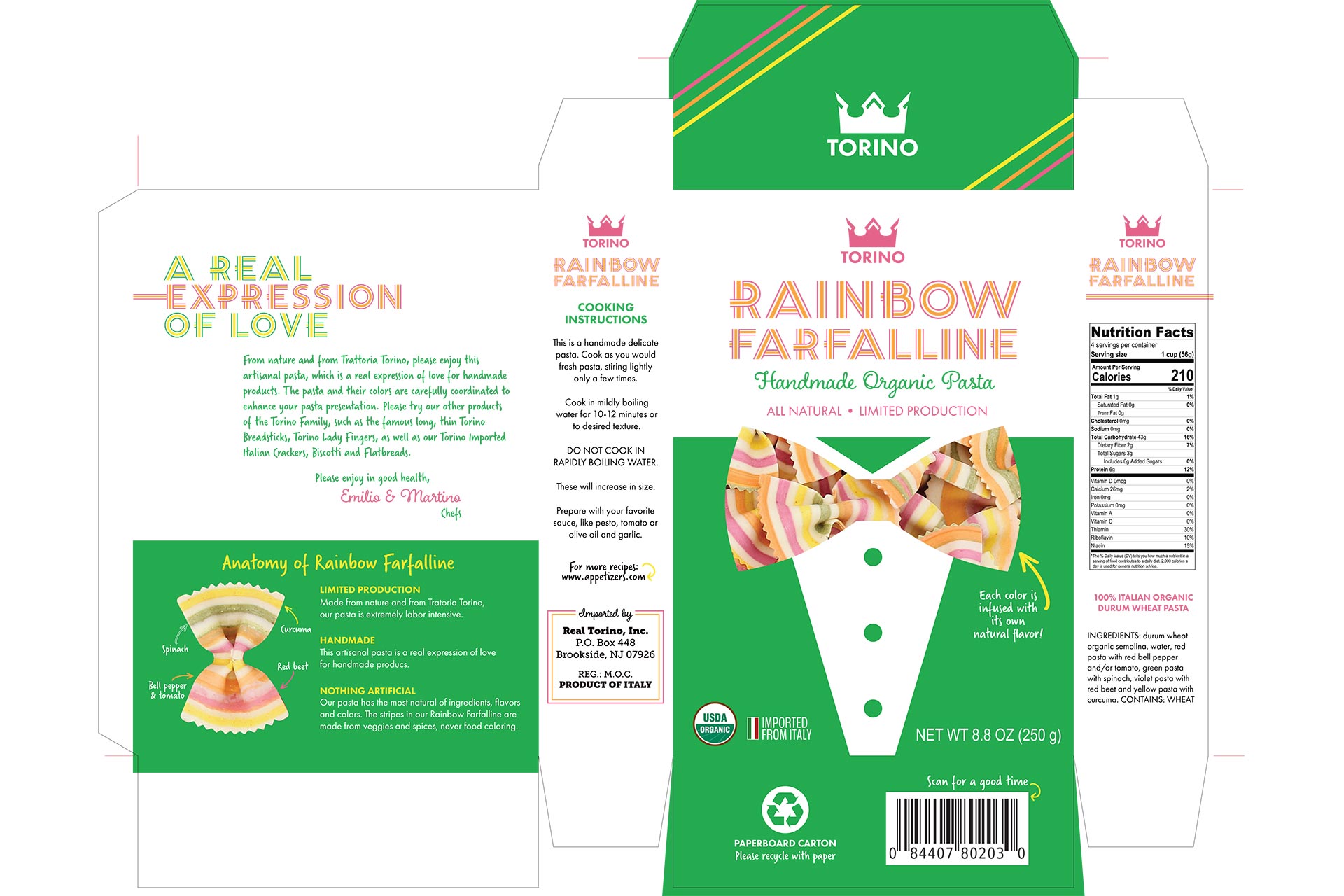
The assignment for this student project was to redesign and improve upon existing packaging. I chose organic Rainbow Farfalline from Torino, which is handmade in Italy. I played off the pasta’s bow tie shape by creating a suit and die-cut tie for the principal display panel. The lettering reflects the stripes in the pasta itself.
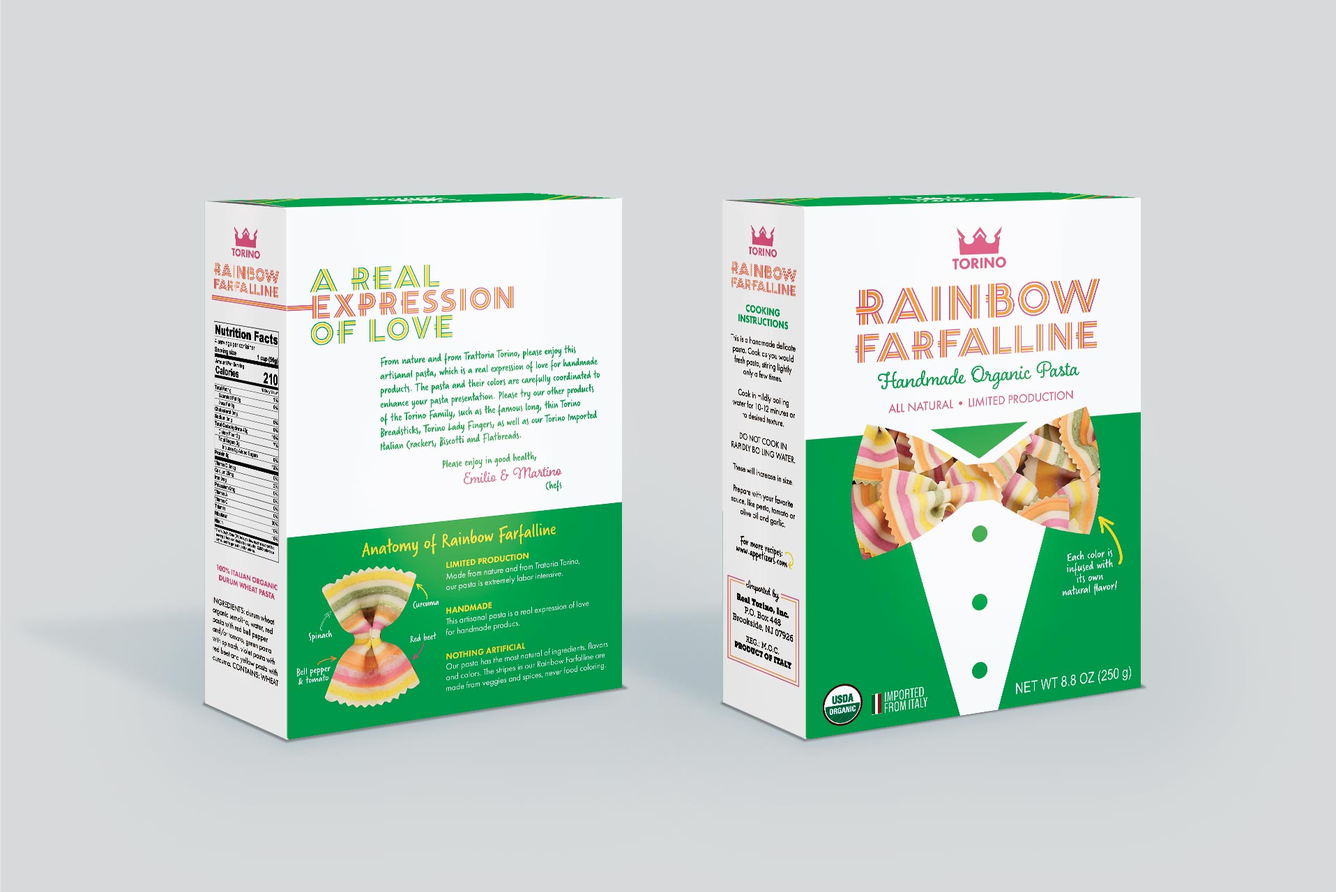
I thought it was crucial to highlight the all-natural ingredients used to make the stripes of the pasta, which was lacking on the original packaging. This is a major selling point for the product, so I featured “The Anatomy of Rainbow Farfalline” on the back panel. Each stripe is labeled with the fruit or veggie used to create it.
Also prominent is a quote I pulled from a paragraph on the original packaging that reflects the company’s commitment to quality: “A real expression of love.”
The combination of vibrant colors, illustration and bold lettering bring new life to this packaging and honors this unique product the way it should.